Designing a Home That Feels Custom Before You Step Inside

A home can feel personal before anyone steps across the threshold, and that impression has very little to do with square footage or expensive finishes. It starts with posture. Some houses sit flat and expressionless against the street, while others carry themselves with quiet confidence. The difference usually shows up in shape, proportion, and how the exterior elements speak to one another. A custom feel is not loud. It is precise. Nothing looks like it was added as an afterthought. Every line appears to have a reason for being there.
Think about the houses that make you slow down while driving past. You may not immediately know why they stand out, yet something about the silhouette, the balance of materials, or the way the entry is framed pulls your attention. This reaction comes from alignment. When structure, surface, and scale are working together, the home feels composed. Designing for that effect requires discipline. It asks you to focus on the bones first, then layer in details that reinforce the architectural idea instead of distracting from it.
Rooflines That Establish Identity
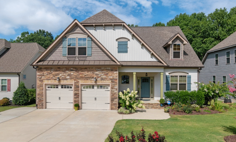
The roofline acts like the signature at the top of the page. Before you notice the trim or landscaping, your eye registers the shape cutting across the sky. A flat, unvaried line can make even a well-built home feel forgettable. Introduce layered gables, controlled slope changes, or extended overhangs, and suddenly the structure carries presence. Depth appears. Shadows form. The home gains dimension without adding ornament.
Material and craftsmanship matter just as much as form. Clean transitions, crisp edges, and consistent installation keep the roof from looking busy or uneven. Working with experienced professionals such as Resnick Roofing & Contracting allows homeowners to match durability with design clarity. A roof installed with precision reinforces the architectural vision rather than competing with it.
Material Pairings That Feel Curated
Exterior materials should feel like they were chosen for a reason, not because they were trending at the time of construction. Pairing stone with smooth siding or warm wood with darker metal trim introduces contrast while still maintaining control. The key lies in restraint. Limiting the palette and assigning each material a specific role keeps the facade from feeling chaotic.
Proportion is where many homes lose their custom edge. A material that works beautifully in small doses can overwhelm when applied across too much surface. Thoughtful distribution allows each texture to breathe and keeps the eye moving naturally across the elevation.
Porch Proportions That Invite Attention
A porch is more than a covered space; it is a transition zone that shapes first impressions. If it is too shallow or visually disconnected from the rest of the facade, it can feel like an attachment rather than an integral feature. A well-scaled porch carries weight and intention. Column spacing, ceiling finish, and railing design should relate directly to the overall architecture.
Even subtle changes in depth or framing can elevate the entire front elevation. When the porch feels grounded and balanced, the home projects a sense of permanence that reads as custom without relying on decoration.
Garage Integration That Feels Intentional
Garages often dominate the front of modern homes, which makes their design critical. Oversized doors with generic detailing can flatten the facade and pull attention away from architectural highlights. The goal is alignment. Door panels, trim, and hardware should echo the language established elsewhere on the home.
Recessing the garage slightly, framing it with complementary materials, or selecting doors that align with window proportions keeps the overall composition intact. Once the garage supports the design rather than competing with it, the house maintains visual harmony.
Front Door Framing That Shows Character
The front door functions as a focal point, but its impact depends on context. A bold color alone does not create presence. Framing elements such as sidelights, layered trim, or a subtle overhang give the door depth and structure. The surrounding space should feel intentional and anchored within the facade.
Hardware selection and scale reinforce that impression. A door that feels proportionate and well-framed communicates personality without excess. Before anyone steps inside, they sense that care went into every visible decision.
Color Choices That Reinforce Lines
Color has the power to either flatten a facade or sharpen it. A single wash of paint across every surface can blur architectural detail, while a controlled palette can highlight depth and proportion. The trim that subtly contrasts with the siding draws attention to window placement and structural breaks. A darker tone along recessed sections can emphasize dimension. The goal is to let color follow structure rather than fight it.
Restraint plays a major role here. Two or three well-related tones often create far more impact than a collection of competing shades.
Balanced Massing Across the Facade
Massing refers to how volumes are arranged across the front elevation. A house with all its height concentrated in one section can feel visually heavy, while evenly distributed projections and recesses create rhythm. Introducing subtle depth changes prevents the facade from appearing flat.
Balance does not require symmetry, yet it does require awareness. The relationship between garage height, entry volume, and roof transitions should be measured.
Visible Craftsmanship in Small Details
Close inspection often reveals whether a home feels custom or standard. Clean trim intersections, well-aligned siding, and consistent spacing around windows communicate care. Even elements such as railing thickness or fascia alignment contribute to the overall impression.
Precision signals intention. When edges are crisp, and finishes are handled with consistency, the facade feels resolved.
Textural Contrast That Adds Depth
Texture introduces visual interest without adding ornament. Smooth stucco next to rough stone, matte finishes beside subtle metal accents, or horizontal siding paired with vertical paneling can create movement across the surface. The contrast should feel controlled and purposeful.
Limiting the number of textures keeps the composition grounded. A thoughtful pairing adds richness while allowing the architecture to remain the focal point.
Intentional Symmetry or Controlled Asymmetry
Some homes rely on symmetry to create order, placing windows and structural features in mirrored positions. Others use asymmetry to introduce character through offset groupings and varied proportions. Either approach can feel custom when it appears deliberate.
Consistency within the chosen method is what matters most. Repetition of spacing, alignment of vertical lines, and intentional placement of focal points give the facade clarity and confidence.
Integrated Outdoor Living Elements
Outdoor spaces visible from the street can enhance the architectural story. A covered patio framed by structural beams or a seating area defined by consistent materials suggests that the home extends beyond its walls. These features should connect visually to the main structure rather than appear appended.
When outdoor living areas share materials, proportions, and design language with the facade, they reinforce the sense of cohesion that defines a custom home.
A home that feels custom before you step inside does not depend on grandeur. It relies on alignment between structure, material, proportion, and detail. Rooflines set the tone, materials refine it, and craftsmanship confirms it.


